idkbin 1.2.3 - A few small changes to make kbin look a tad better en (userstyles.world)
After seeing all of the cool userstyles on here, I decided I'd have a go at learning some CSS and making a userstyle myself.
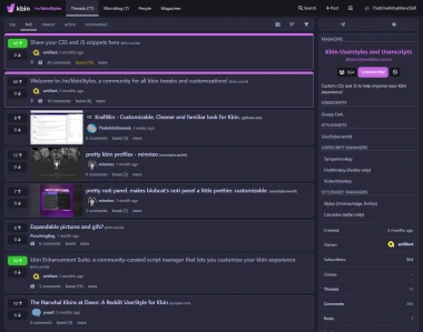
Here's an example of what it looks like
I'm pretty new to this stuff, so feedback is very appreciated.
1.0.0
- Thumbnails are on the left of threads instead of the right.
- Media previews are more limited in height.
- Media previews are better integrated with their articles.
- Favorites (upvotes) and reduces (downvotes) have more contrasting colors.
- The boost button turns yellow when clicked.
- The magazine name in the header is colored magenta.
- Magazine names are more consistently bolded.
- Pinned posts are distinguished with a magenta outline.
- Links and buttons have a smoother transition when hovered over.
- Magazine icons are square and smaller.
1.1.0
- A ton of different settings are now available (e.g., toggling features, changing colors).
- The subscribe button is magenta when clicked.
- The block button is red when clicked.
- Your username is colored yellow on your posts and comments.
- (Disabled by default) The magazine name on the sidebar is magenta.
- (Disabled by default) Inline magazine names are magenta.
1.1.1
- Magazine icon size can now be changed in settings.
- Whether the magazine stretches with its icon size can be toggled in settings.
1.2.0
- The code is (hopefully) compatible with the layout changes rolled out on July 5.
- The search and add post buttons now have text.
- Image previews have a darker background.
1.2.1
- The darker background for image previews differs depending on theme.
1.2.2
- In the comments of a thread or post, OP's username is colored magenta.
- The text for the search and post icons are properly aligned.
- The select channel icon is properly aligned with the other icons.
1.2.3
- The show preview button is now colored.
- *(Disabled by default) The blurred background of thumbnails can be removed.